──
Lettering · Typography
Exploring Typography Through Stickers
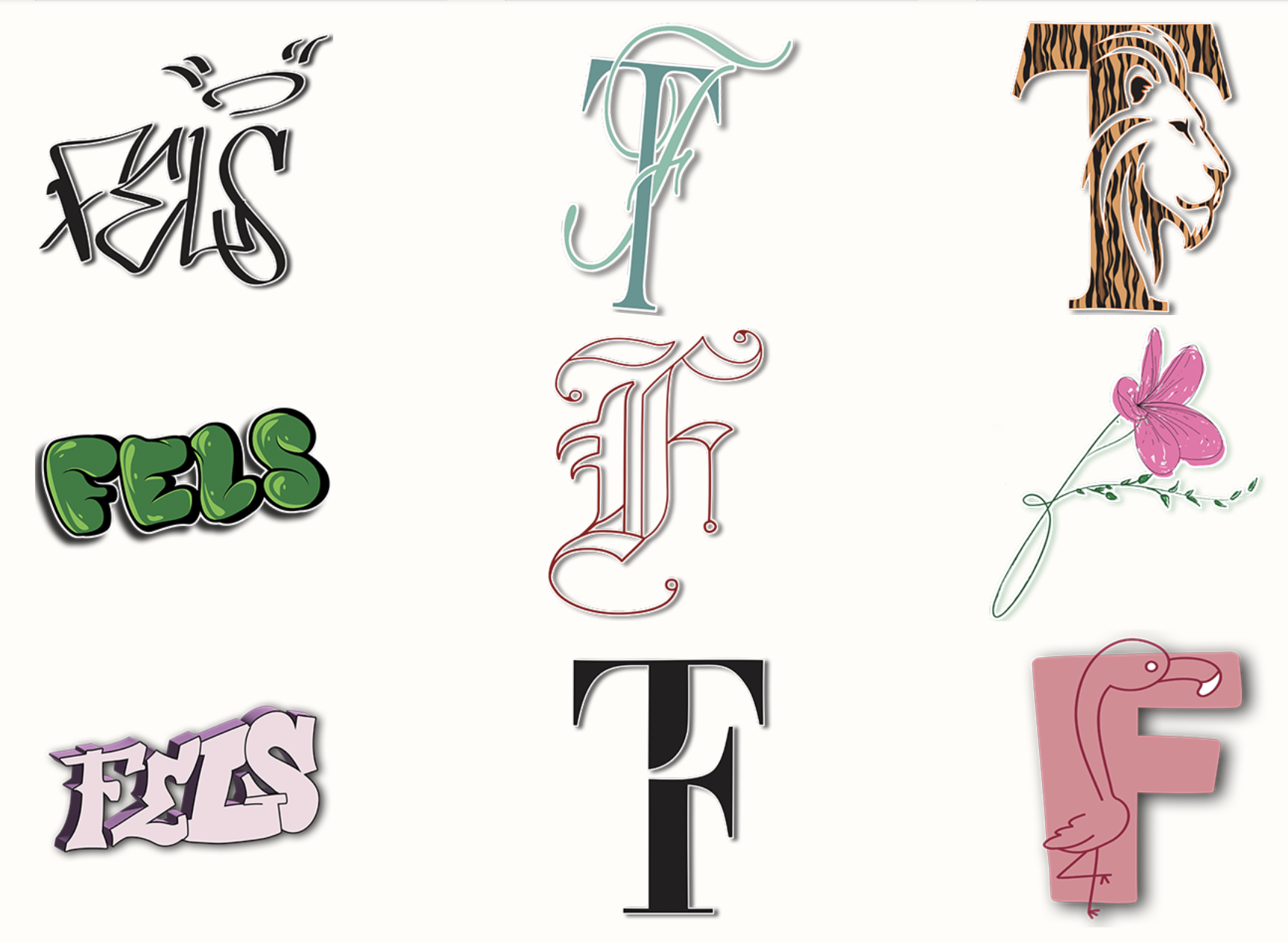
For this project, I had to create a series of stickers using three different lettering styles: graffiti/tag, monograms and illustrated capitals. I had to create at least three designs for each style, which gave me a lot of room to try different letter shapes and ideas.
I started by sketching different ideas for each style. For the graffiti stickers, I played with loose and bold letter shapes to give them a more hand-drawn look. For the monograms, I focused on combining letters and finding ways to make them work together as one shape. The illustrated capitals gave me more freedom to play with the letters and add drawings around them.
Once I had some ideas I liked, I brought them into Illustrator and worked on the shapes, line weight and small details. I wanted each sticker to have its own style, while still making the designs feel like they belonged together. I tested different versions before choosing the ones that looked best at a smaller size.
After finishing the designs, I prepared them for printing and put them together on a sticker sheet. I also created a website to show the stickers online. Each sticker has its own page where the artwork can be viewed at full size. I made sure the images were the right size for the web and created my own type system and styling instead of using the default website elements.
Overall, this project helped me look at typography in a different way. Instead of only using letters as text, I got to turn them into shapes, drawings and other design elements. Working with graffiti, monograms and illustrated capitals also showed me how much a letter can change depending on its shape and style.
Felicia Tugulea · 15 May 2026 · 4 min read