Fonts have personalities too: How typography shapes brands
When you think of typgraphy, you probably think of words on a paper or words on a screen. Did you know that there is more to a font than just its look. Fonts can be used to portray a feeling, an emotion. It is not just words on a screen. Its a stylistic choice that can make or break your brands identity if chosen incorrectly.
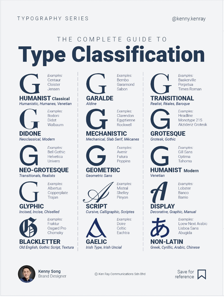
Different styles: italic, serif, sans-serif – weights: slim to bold and how does it change the feel
So, how can something as simple as a font change the entire personality of a brand?
Key Concepts
Hierarchy: The arrangement of text sizes and weights to show importance and guide the reader’s eye. [1, 2, 3]
Typeface: A family of related fonts sharing a similar design (e.g., Arial or Times New Roman).
Font: A specific weight, style, or size within a typeface family (e.g., Arial Bold).
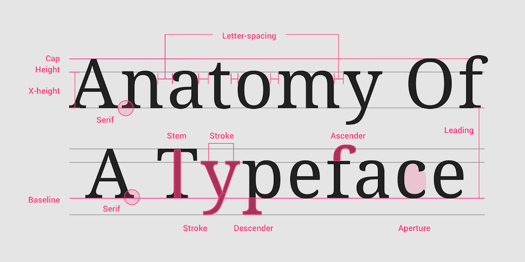
Baseline: The invisible line upon which letters rest.
Serif vs. Sans Serif: Serifs are small decorative feet at the ends of letter strokes; sans serifs lack these extra elements.
Kerning and Tracking: Kerning adjusts the space between a single pair of characters, while tracking changes the spacing across an entire word or block of text.
Leading: The vertical distance between base lines of adjacent lines of text.

Leave a Reply