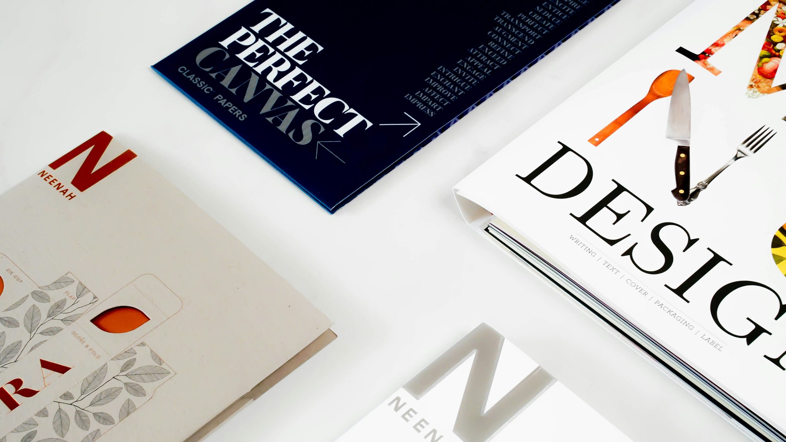
Pair Fonts Like a Pro
Ever notice how some designs just feel right? Chances are, the fonts are doing more work than you think. Learning to pair fonts well is not about luck. It is about balance.
Pair Fonts With the Right Contrast
The golden rule of font pairing is simple: contrast, don’t clash. Pick fonts that are different enough to stand apart, but similar enough to feel like a team. A classic combo is a serif for headlines and a sans-serif for body text. Think bold and elegant, paired with clean and readable.
Avoid using two fonts from the same style family. Two scripts together often look messy. Two bold display fonts often compete instead of complement.
The Rule of Two (Sometimes Three)
Most designs work best with just two fonts. One for headlines, one for body text. Adding a third font can work, but only for small accents like a logo or a button label. Too many fonts confuse the eye and weaken your brand.
Match the Mood
Fonts carry emotion, so make sure your pairing tells one consistent story. A playful display font paired with a stiff, corporate serif sends mixed signals. Keep the personality of both fonts aligned with your brand’s voice.
Test Your Pairings at Different Sizes
A pairing that looks great in a headline might fall apart in small print. Always test your fonts at different sizes before locking anything in. Readability always comes first, no matter how stylish a font looks.
Use Free Tools to Find the Right Pairings
Sites like Google Fonts and Adobe Fonts often suggest pairings for you. These tools are a great starting point if you are unsure where to begin.
Great font pairing is not about following strict rules. It is about balance, contrast, and consistency. Once you get a feel for it, your designs will look sharper, and more professional, instantly.
What are your go-to font pairings? Drop them in the comments below!
Explore the Details
Like letters that take on new meaning through shape, space, and form, every design tells a story, revealing the emotions hidden within what we see.