──
Creative process
on/ off grid poster.
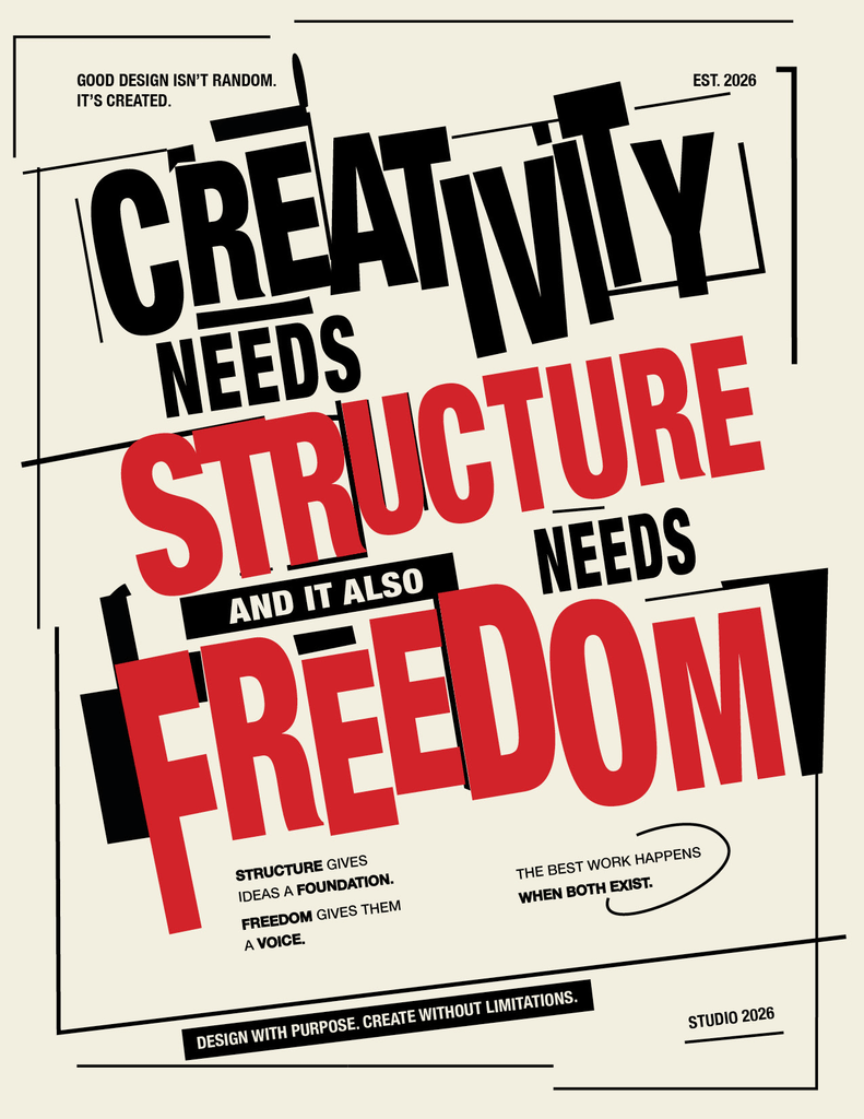
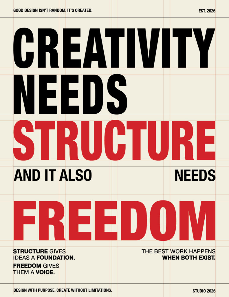
For this project, I had to create two versions of a layout using only typography and colour. I chose the quote “Creativity needs structure, and it also needs freedom” because I liked how it connected directly to the main idea of the assignment. The two versions allowed me to visually show the difference between structure and freedom while still using the exact same text and typefaces.
To start, I made a few different drafts and experimented with how I could organize the quote. For the first version, I focused on the word “structure” and followed a strict grid. The text stays aligned with the grid lines, and the different elements have a clear relationship with each other. I wanted the layout to feel organized and controlled while still having some personality through the use of colour and typography.
For the second version, I focused more on the idea of “freedom.” Instead of following the grid, I intentionally broke away from it and experimented with different placements, angles and sizes. My inspiration came from Constructivist design, especially the use of diagonal lines, geometric shapes and bold typography. Moving the text around helped create a more energetic and dynamic composition compared to the first version.
Another important part was making sure that both designs still communicated the quote clearly. Even though I changed the placement of the elements, the viewer should still be able to understand the message without the layout becoming too confusing.
Overall, I liked seeing how much the same text could change just by changing its structure. The first version feels more controlled and organized, while the second feels more expressive and experimental. This project showed me that a grid can help create structure, but breaking away from it can also create more freedom and movement in a design.
“Typography is the craft of endowing human language with a durable visual form.”
ROBERT BRINGHURST