──
Creative process
Static.
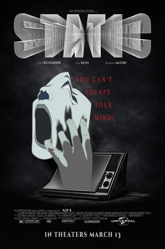
For this project, I had to create a movie poster with a clear message and a specific audience in mind. I decided to make a horror/thriller movie called STATIC. The idea came from how media and algorithms can affect the way we see and understand things. I wanted the poster to feel creepy and a little confusing, while still making the main idea understandable.
To start, I looked at different horror and thriller posters for inspiration and paid attention to how they used images, typography, lighting and composition. After that, I made a few sketches before deciding what I wanted the main image to be. I ended up using a TV with a hand and a mask-like figure coming through the screen. I liked this idea because it made it look like the person could be controlled by what they were seeing. Smoke was also added around the image to make it feel more mysterious and unsettling.
For the title, I chose STATIC because it connects to the TV and the idea of interference. While working on the typography, I played around with different effects and added a static effect to make the letters look distorted. I wanted it to give the feeling of a mind-fogging effect, like what could happen when you are constantly exposed to media. The title also needed to stand out without taking attention away from the main image.
I kept the colours mostly dark to fit the horror/thriller style. Contrast helped me make the main image and title stand out from the background. Another thing I had to think about was the placement of everything so that the viewer would notice the main image and title first, followed by the smaller information.
I went through a few different ideas before getting to the final version. Overall, I wanted to create something that felt like an actual movie poster while still communicating the idea behind.
“When it feels scary to jump, that is exactly when you jump, otherwise you end up staying in the same place your whole life…”
ABEL MORALES